
DOKA Furniture store landing page
A clean and modern landing page for the online furniture store “Doka”. The site sells comfort and style through high-quality photographs, clear navigation and a soft, light palette. The emphasis is on the fact that furniture should make a home a place where you want to live.
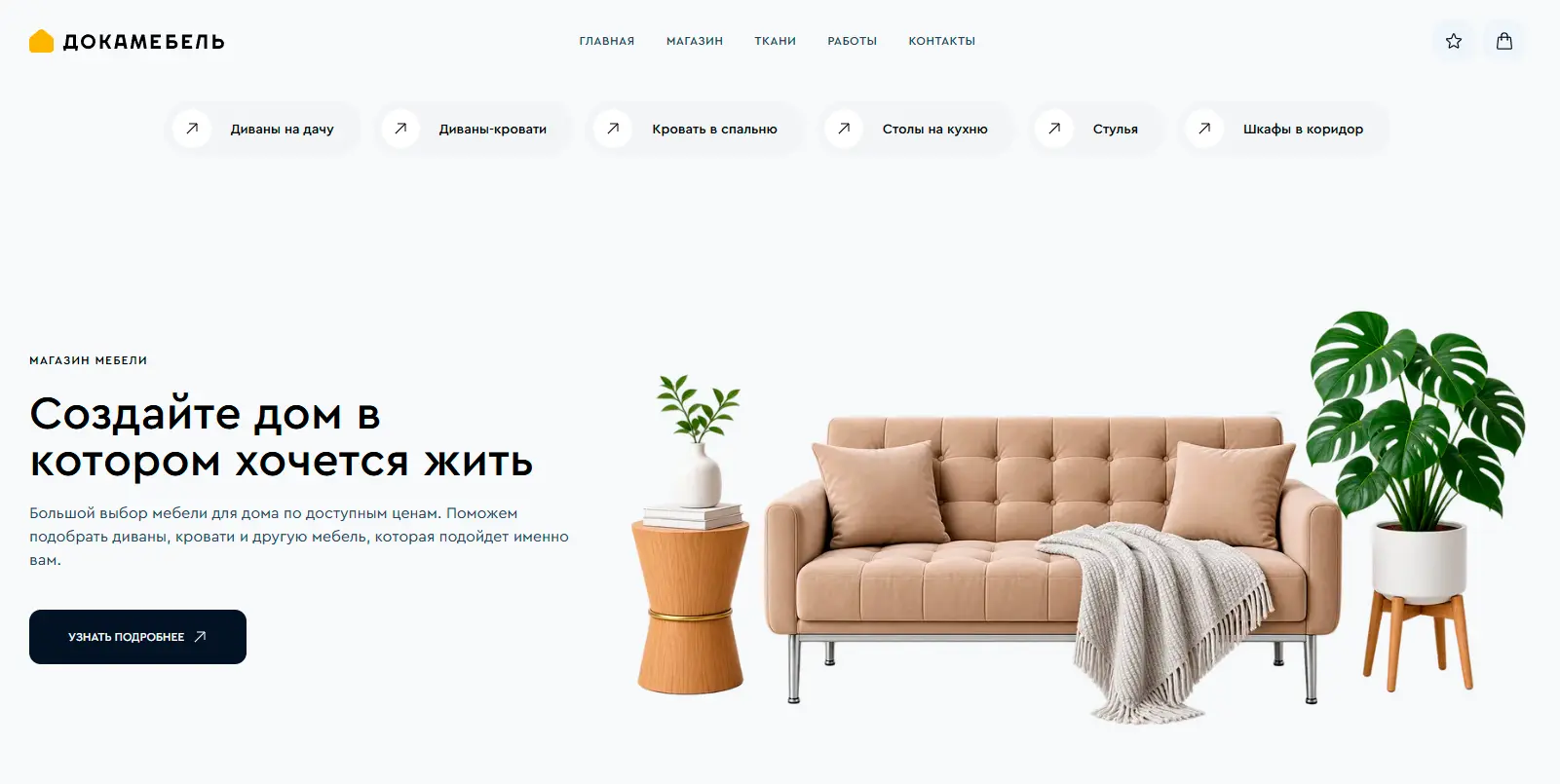
Hero Section
A large headline reads "Create a Home You"ll Want to Live In" and a short description of the wide selection of furniture at affordable prices. On the right is a stylish composition with a beige sofa, table, and plants. A dark CTA button, "Learn More," leads the user further. Category navigation (Sofas, Armchairs, Beds, Tables, Chairs, Wardrobes) is located just below the header for quick navigation.

Advantages
Four key values with icons:
- Quality of materials
- Modern design
- Comfort and functionality
- Attention to detail
The block quickly builds trust and explains why this particular store is worth choosing.
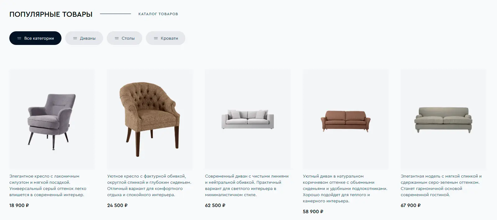
Popular Products
Large product grid with filters (All Categories, Sofas, Tables, Armchairs). Each product is displayed on a white background with its name, brief description, and price. The clean card structure makes it easy to compare models and quickly find the perfect fit.
Partners
Manufacturer logos (ARBEN, UNIQ, SOYUZ-M, VECTOR) in a separate block. Enhances the feeling of reliability and quality.
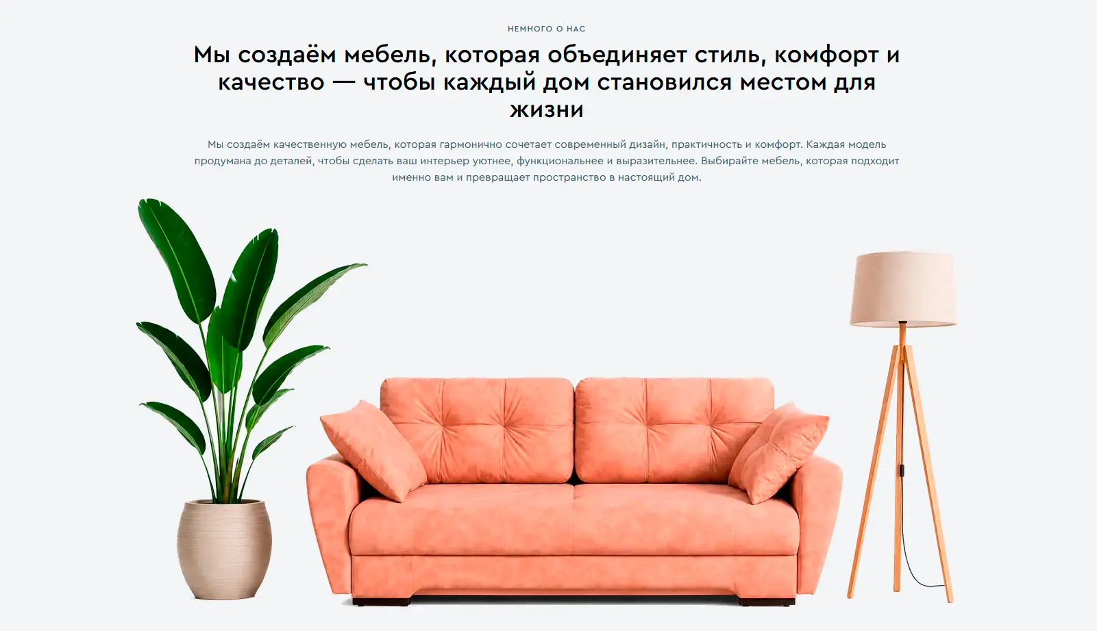
About Us
An emotional text block, "We create furniture that combines style, comfort, and quality," with a large photo of a pink sofa in a home. The text emphasizes that each model is thoughtfully designed down to the last detail and helps make your home more comfortable.

Reviews
Two customer reviews with photos, names, and cities. Quotes are short and to the point—about quality, appearance, and convenience. The section adds social proof.
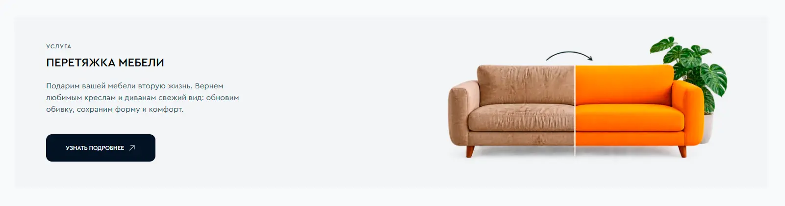
Additional service
The "Furniture Reupholstery" section features before/after photos and encourages you to give your armchairs and sofas a new lease of life. It expands the store"s offerings and provides an additional entry point.
Footer
A light footer with a logo, brief description, and columns for "Company," "Store," and "Contacts." It contains navigation, links to categories, address, phone number, email, and copyright information. It neatly closes the page and provides quick access to all important information.
Result
The landing page combines minimalist design with commercial clarity. It leads users from inspiration and benefits through the catalog and reviews to contacts and additional services, creating the feeling of a reliable store where it"s easy to choose furniture for a real home.